Friday, 4 April 2014

4 Different Styles For the Popular Posts Widget

 Blogger allows us to easily add a "Popular Posts" widget, that we select from its list of gadgets, and we can do that by going to the "Layout" of our Blog.

This gadget, as the name implies, shows which are the most visited blog posts, and you can set it to display the info you want in four possible combinations: (1) only the title of the post, (2) a thumbnail of the image and the post title, (3) post title with a summary, and (4) post title with a thumbnail and a post snippet.

This is an element that you shouldn't miss in your blog because it encourages your visitors to navigate through your content and that can result in higher income if you're monetizing your blog because it would generate an increase in the number of pages visited, and in turn, can attract the users' interest to subscribe to the blog and to read interesting content.

Preliminary steps: Add the gadget, if you haven't done it yet.


1. Select the "Layout" tab and add the "Popular Posts" gadget in that part of your blog you want to appear, such as in your sidebar, by clicking on "Add a Gadget".

2. Configure the widget to show only the post titles. You can do this by clicking on the "image thumbnail" and "snippet" checkboxes, as shown in the following image.

3. After configuring the widget, save the changes by clicking on Save, and then Save arrangement.

How to add the CSS to create the style of the Popular Posts widget


1. Choose a style, then copy the CSS that appears below the image that shows the style.

2. Select the "Template" tab, then click on Customize > Advanced > Add CSS and then paste the CSS style that you like the most.

blogger tutorials
3. Once you add the CSS, Save changes by clicking on the "Apply to Blog" button.

Note: Some Blogger templates might not allow adding CSS in that location. In that case, for adding the CSS style you need to access the Template's HTML - from your Blogger Dashboard, go to Template > Edit HTML and paste the code just above the ]]></b:skin> tag (press the CTRL + F keys to find it - you might need to click on the arrow to expand the code and after that search it again)

And that's it! You've already customized the popular posts widget when it shows only post titles.

Styles

Here is the CSS of each style, just choose the one you like the best and put it on your blog. You can see each of these styles in action in the following demo blog:


Style 1:
blogger gadgets, blogger widgets, popular posts widget
#PopularPosts1 h2{
padding:7px 0 3px 0;
width:100%;
margin-bottom:10px;
font-size:1.3em;
text-indent:-12px;
font-size:18px;
text-align:center;
color: #757575; /* Color of the widget's title */
}
#PopularPosts1 ul{
list-style:none;
counter-reset:li;
padding:8px 0px 1px;
left:-7px;
width:290px;
}
#PopularPosts1 li{
position:relative;
margin:0 0 10px 0;
padding: 3px 2px 0 17px;
left:-5px;
width:285px;
}
#PopularPosts1 ul li{
background: #eee;
position: relative;
display: block;
padding: .4em .2em .4em 2em;
*padding: .2em;
margin: .5em 0;
background: #ddd;
text-decoration: none;
border-radius: .3em;
transition: all .3s ease-out;   
}
#PopularPosts1 ul li:before{
content: counter(li);
counter-increment: li;
position: absolute; 
top: 50%;
margin: -1.3em;
height: 2em;
width: 2em;
line-height: 2em;
font-size: 15px;
color: #fff; /* text color of numbers */
background: #FB8835; /* background color of numbers */
border: .2em solid #fff; /* border color */
-webkit-box-shadow: 0 8px 5px -7px #888;
-moz-box-shadow: 0 8px 5px -7px #888;
box-shadow: 0 8px 5px -7px #888;
text-align: center;
font-weight: bold;
border-radius: 2em;
position: absolute;   
left: 0;
transition: all .3s ease-out;
}
#PopularPosts1 ul li:hover{
background: #eee;
}
#PopularPosts1 ul li:hover:before{
transform: rotate(360deg);   
}
#PopularPosts1 ul li a{
font: 14px Georgia, serif; /* font size of post titles */
text-shadow: 0 -1px 2px #fff;
color: #444;
display:block;
min-height:25px;
text-decoration:none;
text-transform: uppercase;
}
#PopularPosts1 ul li a:hover{
color: #444;
}

Style 2:
blogger gadgets, blogger widgets, popular posts widget
#PopularPosts1 h2{
position:relative;
padding:8px 10px 6px 10px;
width:100%;
margin-bottom: 5px;
font-size:17px;
color:#757575; /* Color of the widget's title */
text-align:left;
}
#PopularPosts1 ul{
list-style:none;
counter-reset:li;
padding:10px;
left:-8px;
width:100%;
}
#PopularPosts1 li{ /* Styles of each element */
width:100%;
position:relative;
left:0;
margin:0 0 1px 12px;
padding:4px 5px;
}
#PopularPosts1 ul li:before{
content: counter(li);
counter-increment: li;
position: absolute; 
left: -30px;
top: 50%;
margin-top: -13px;
background: #8E8E8E; /* background color of the numbers */
height: 1.9em;
width: 2em;
line-height: 2em;
text-align: center;
font-weight: bold;
color: #fff;
font-size: 14px;
}
#PopularPosts1 ul li:after{
position: absolute;
content: '';
left: -2px;
margin-top: -.7em; 
top: 50%;
width: 0;
height: 0;
border-top: 8px solid transparent;
border-bottom: 8px solid transparent;
border-left:10px solid #8E8E8E; /* background color of the right arrow*/
}
#PopularPosts1 ul li a{
color: #444;
text-decoration: none;   
font-size:15px;
}
#PopularPosts1 ul li {
position: relative;
display: block;
padding: .4em .4em .4em .8em;
*padding: .4em;
margin: .5em 0 .5em 0.4em;
background: #ddd;
transition: all .3s ease-out;
text-decoration:none;
transition: all .1s ease-in-out;
}
#PopularPosts1 ul li:hover{
background: #eee; /* Background color on mouseover */
}   
#PopularPosts1 ul li a:hover{
color:#444; /* Link color on mouseover */
margin-left:3px;
}

Style 3:
blogger gadgets, blogger widgets, popular posts
#PopularPosts1 h2{
position:relative;
right:-2px;
padding:8px 63px 6px 17px; 
width:100%;
margin:0;
font-size:16px;
background:#4F4F4F; /* Background color */
color:#f2f2f2; /* Color of the widget's title */
text-align:left;
text-indent:18px;
}
#PopularPosts1 h2:before{
position:absolute;
content:"";
top:36px;
right:0px;
width: 0px;
height: 0px;
border-bottom:12px outset transparent;
border-left:12px solid #000000; 
}
#PopularPosts1 h2:after{
position:absolute;
content:"";
top:-6px;
left:-5px;
width: 0px;
height: 0px;
border-bottom:24px outset transparent;
border-top:24px outset transparent;
border-left:24px solid #ffffff; /* Arrow background color on the left */
}
#PopularPosts1 ul{
list-style:none;
counter-reset:li;
padding:10px;
left:-8px;
width:100%;
}
#PopularPosts1 li{ 
width:100%;
position:relative;
left:0;
margin:7px 0 16px 12px;
padding:10px  4px 0 5px;
}
#PopularPosts1 ul li:before{ 
content:counter(li);
counter-increment:li;
position:absolute;
top:-2px;
left:-20px;
font-size:35px;
width:20px;
color:#888888; 
}

#PopularPosts1 ul li a{
display:block;
font-size:16px; /* Font size of the links */
color: #666; /* Color of the links */
text-decoration:none;
transition: all .1s ease-in-out;font-weight: bold;
}
#PopularPosts1 ul li a:hover{
color:#3366FF;
margin-left:3px;
}

Style 4:
blogger gadgets, blogger widgets
#PopularPosts1 h2{
padding:8px 10px 3px 0;
width:100%;
margin:0;
font-size:16px;
position:relative;
left:-20px;
display:block;
border-bottom:2px solid #ccc;
}
#PopularPosts1 ul{
list-style:none;
counter-reset:li;
padding:10px;
width:100%;
}
#PopularPosts1 li{ /* Styles of each element */
width:100%;
position:relative;
left:0;
margin:0 0 6px 10px;
padding:4px 5px;
}
#PopularPosts1 ul li:before{ /* Style of the numbers */
content:counter(li);
counter-increment:li;
position:absolute;
top:3px;
left:-39px;
font-size:21px;
width:28px;
height:28px;
border-radius: 50%;
color:#777; /* Text color */
border: 2px solid #ddd; /* Rounded border color */
padding:0;
text-indent:9px;
}
#PopularPosts1 ul li a{
display:block;
position:relative;
left:-45px;
width:100%;
margin:0;
min-height:28px;
padding: 5px 3px 3px 39px;
color:#333; /* color of the links */
text-decoration:none;
font-size:14px; /* Font size of the links */
font-style: italic;

}
#PopularPosts1 ul li a:hover{
color:#3366ff;
margin-left:3px;
}

Final Notes

All the CSS is valid. I just have to mention that the numbering is not visible in Internet Explorer 7, since that version of the browser does not support properties that make the numbers appear. For example in the 4th style, the circles look squared in IE8 and earlier versions since, these versions do not support a property that makes them look as circles.  

Adding a Youtube Video in the Background of a Blogger blog

 Some of you might have wondered how to put a video to play in the blog's background, so that instead of having just a color or an image, to have a video. We can do this thanks to the jQuery plugin Tubular that lets you use a YouTube video as a background of a web page.

Although the result can be very original and attractive, I must say it has three drawbacks: they can not be silenced, if the video has ads, they will also appear, and it can slow the loading time of the blog, so if anyone wants to use it, may consider putting it only on special occasions, or on blogs that load very quickly.

Also it can be done in HTML5, the problem with this method is that you need to load the video in 3 different formats (.mp4, .webm and .ovg) along with a picture for browsers that do not support them, so this YouTube option seems more practical to me, despite the drawbacks.

blogger gadgets, blogger tricks, blogger widgets

You can see it working on this demo blog

Steps 

1. The first step is to just above the </head> tag, this script:
<script src='http://ajax.googleapis.com/ajax/libs/jquery/1.10.2/jquery.min.js' type='text/javascript'/>

<script type='text/javascript'>
//<![CDATA[
/* jQuery tubular plugin
|* by Sean McCambridge
|* http://www.seanmccambridge.com/tubular
|* Copyright 2012
|* licensed under the MIT License
|* Enjoy.
|* 
|* Thanks,
|* Sean */

var videoWidth = 853; 
var videoRatio = 16/9; 
var defaultDiv = 'wrapper-video';

jQuery.fn.tubular = function(videoId,wrapperId) {
wrapperId = (typeof(wrapperId) == undefined) ? 'wrapper-video' : wrapperId;
t = setTimeout("resizePlayer()",1000); 

jQuery('html,body').css('height','100%');
jQuery('body').prepend('<div id="yt-container" style="overflow: hidden; position: fixed; z-index: 1;"><div id="ytapiplayer">You need Flash player 8+ and JavaScript enabled to view this video.</div></div><div id="video-cover" style="position: fixed; width: 100%; height: 100%; z-index: 2;"></div>');
jQuery('#' + wrapperId).css({position: 'relative', 'z-index': 99});

var ytplayer = 0;
var pageWidth = 0;
var pageHeight = 0;
var videoHeight = videoWidth / videoRatio;
var duration;

var iframe = '<iframe id="myytplayer" width="' + videoWidth + '" height="' + videoHeight + '" src="http://www.youtube.com/embed/' + videoId + '?autoplay=1&controls=0&modestbranding=1&showinfo=0&hd=1&iv_load_policy=3&version=3&wmode=transparent&loop=1&playlist=' + videoId + '" frameborder="0" allowfullscreen></iframe>'; 

jQuery('#ytapiplayer').html(iframe);
jQuery(window).resize(function() {
resizePlayer();
});
return this;
}

function onYouTubePlayerReady(playerId) {
ytplayer = document.getElementById("myytplayer");
ytplayer.setPlaybackQuality('medium');
ytplayer.mute();
}

function resizePlayer() {
var newWidth = jQuery(window).width(); 
var newHeight = jQuery(window).height(); 
jQuery('#yt-container, #video-cover').width(newWidth).height(newHeight);
if (newHeight > newWidth / videoRatio) { 
newWidth = newHeight * videoRatio; 
}
jQuery('#myytplayer').width(newWidth).height(newWidth/videoRatio);
}

//]]>
</script>
And this one too: 
<script type='text/javascript'>
//<![CDATA[
$().ready(function() {
$('body').tubular('61BLn00AN_w','wrapper-video'); 
});
//]]>
</script>
2. Then locate the <body> tag (CTRL + F)
Or if you are using a template from Template Designer, find this line:
<body expr:class='&quot;loading&quot; + data:blog.mobileClass'>
3. Under either of these two, add this:
<div id='wrapper-video'>
4. Now search for the </body> tag, and before it put this:
</div>
Save the changes and that's it. In red you must put the ID of Youtube video, the ID are the characters that appear at the end of the URL:


Remember: There is no option to mute, so if you don't want to have sound as in the demo blog, you have to choose a video that has no sound. I also recommend using a video in HD in case you don't want any black parts to show around it.

If you are using jQuery, remove other versions that you have to avoid duplication and have problems.

How to Add a Tiny jQuery Circleslider to Blogger

Tiny Circleslider is a small jQuery plugin generating a circular carousel of images that we can slide infinitely (circular). When clicking on the red dot, the main picture moves to the left and another set of images will slide out. There is noting complicated about using this type of carousel, however when it's about customizing it, it's necessary to use a bit of arithmetic. All these details can be found in the author's homepage, so I'll just limit myself to show you the basics.

Adding the Tiny Circleslider to the Blog


In order to make it work, first task is to add the javascript jQuery library in our template:

Step 1. From your Blogger's dashboard, select your blog

Step 2. Go to Template and click the Edit HTML button:


Step 3. Click anywhere on the code area and search by using the CTRL + F keys for this tag:
</head>
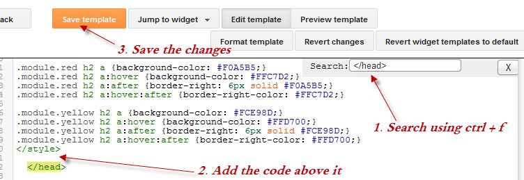
Step 4. Just above the </head> tag, add the following scripts:
<script src='http://ajax.googleapis.com/ajax/libs/jquery/1.10.2/jquery.min.js' type='text/javascript'/>
<script src="http://helplogger.googlecode.com/svn/trunk/jquery.tinycircleslider.min.js"/>
Step 5. We need to add the CSS styles above the </head> tag, as well:
<style>
  #rotatescroll { /* is the rectangle container */
    height: 300px;
    position: relative;
    width: 300px;
  }
  #rotatescroll .viewport { /* is the rectangle containing the images */
    height: 300px;
    position: relative;
    margin: 0 auto;
    overflow: hidden;
    width: 300px
  }
  #rotatescroll .overview { /* is the list with the images */
    left: 0;
    list-style: none; 
    margin: 0;
    padding: 0;
    position: absolute;
    top: 0;
  }
  #rotatescroll .overview li { /* each item of the list */
    float: left;
    height: 300px;
    position: relative;
    width: 300px;
  }
  #rotatescroll .overlay { /* the image with the circle overlapping the list */
     background: transparent url(https://blogger.googleusercontent.com/img/b/R29vZ2xl/AVvXsEgIvVCphyjo8eNx96OfevRb9bREBCV3898BY7QMkQlZ6mAkGwS2RcPkyt_2wIjBvZjwOQTQCDl6OJzmIIyAlGW9Cf8TRoVOy2QCuwVcLkFq4FEuQUb9xbPb7M_A-yObBjJj3mThz6s6E4Nb/s1600/bg-rotatescroll.png) no-repeat 0 0;
    height: 300px;
    left: 0;
    position: absolute;
    top: 0;
    width:300px;
  }
  #rotatescroll .thumb { /* the red circle that allows us to navigate */
     background:transparent url(https://blogger.googleusercontent.com/img/b/R29vZ2xl/AVvXsEitIdAHdO_-lwKwm2xfWncz1rDcP-HZATavNw1Qm3dbBZ6MY4fgR-7PcdjFh3IjxnJLDjMy9IOeGh4MvbGI2hGFXPqcsRi-NhbpqOVJ_TUDboLF7xQhovACpcLCbEs4YiEg9A2Oynf36KWU/s1600/bg-thumb.png) no-repeat 0 0;
    cursor: pointer;
    height: 26px;
    left: 137px;
    position: absolute;
    top: -3px;
    width: 26px;
    z-index: 200;
  }
  #rotatescroll .dot { /* the points indicating the position of each image */
     background: transparent url(https://blogger.googleusercontent.com/img/b/R29vZ2xl/AVvXsEjAJUrIyviru-7phcMptmzowkB2B6Cdo4D-iMdEObZRvEyg3MVPrj1tJw8szU1qduzwsZFGKYmeUzSDnw4oINdoddhxOIXrDj_AZL3ucw-gBoC0a2jhM56Rft7V0p-4o4u9RhFj7gDpfMe6/s1600/bg-dot.png) no-repeat 0 0;
    display: none;
    height: 12px;
    left: 155px;
    position: absolute;
    top: 3px;
    width: 12px;
    z-index: 100;
  }
  #rotatescroll .dot span { /* are hidden by default */
    display: none;
  }
</style>
Screenshot
Step 6. Save the changes by clicking the Save Template button

Now here's the HTML that has to be added to where we want to display the carousel.
To add it inside a post the click the New post on the left side of your dashboard and paste the code below by going to the HTML tab:
<div id="rotatescroll">
  <div class="viewport">
    <ul class="overview">
      <li><img src="imageURL" /></li>
      <li><img src="imageURL" /></li>
      <li><img src="imageURL" /></li>
      <li><img src="imageURL" /></li>
      <li><img src="imageURL" /></li>
    </ul>
  </div>
  <div class="dot"></div>
  <div class="overlay"></div>
  <div class="thumb"></div>
</div>

<script type="text/javascript">
$(document).ready(function(){ $('#rotatescroll').tinycircleslider(); });
$('#rotatescroll').tinycircleslider({ interval: true, snaptodots: true });
</script>
blogger template
Screenshot

Note: replace the imageURL text with the URL of your images

and here are other options that could be added, separated by commas:

snaptodots - false if you want no dots to be shown when dragging them
hidedots - false if you want to display the internal points (by default is true)
intervaltime - is the time between slides (by default 3500)
radius - defines the size of the circle (by default is 140)

If you want to add it to your sidebar, simply go to Layout, click the Add a Gadget link > from the popup window, choose HTML/Javascript and paste the code inside the empty box.  

How To Add Snow In The Background of Your Blog Using CSS

 Today we’re going to go over a super simple CSS technique that you can use to make it snow on your Blogger blog. It seems particularly attractive since it doesn't require scripts, only CSS and three small images.

An advantage of this method is that by not using scripts doesn't overload the blog, the disadvantage is that users with not so modern browsers, will not be able to see it (in Internet Explorer works for version 10 and up).

The snow will fall in the background of the blog, which, in addition, prevent interfering with links or content (because the flakes are images), also prevent blocking the visibility of the content of the blog.

falling snow, snow, winter background, blogger

You can see the demo in this test blog.

How To Add Falling Snow To Blogger Blogspot


Step 1. Go to Template and click on the Edit HTML button: 


Step 2. Click the small arrow on the left of <b:skin>...</b:skin> to expand the style (screenshot 1) and click anywhere inside the code area to search by using the CTRL + F keys for the ]]></b:skin> tag (screenshot 2)

Step 3. Add the following code just above it:
/* Snow falling for Blogger
----------------------------------------------- */
@keyframes snow {
0% {background-position: 0px 0px, 0px 0px, 0px 0px;}
100% {background-position: 500px 1000px, 400px 400px, 300px 300px;}
}

@-moz-keyframes snow {
0% {background-position: 0px 0px, 0px 0px, 0px 0px;}
100% {background-position: 500px 1000px, 400px 400px, 300px 300px;}
}

@-webkit-keyframes snow {
0% {background-position: 0px 0px, 0px 0px, 0px 0px;}
100% {background-position: 500px 1000px, 400px 400px, 300px 300px;}
}

@-ms-keyframes snow {
0% {background-position: 0px 0px, 0px 0px, 0px 0px;}
100% {background-position: 500px 1000px, 400px 400px, 300px 300px;}
}

#falling-snow {
background-image: url(https://blogger.googleusercontent.com/img/b/R29vZ2xl/AVvXsEid5egH_hpVhC6mr79hVD0MvgBcTKaz5uAc2qJhxq0Rf-A4KKbwlCw7D1ycOt0H7kUTF8bh50Y2tk3Ypx9EdCBMj6nEBjZr9Rd4M57tc9xzJvtECJ6gHz2doGPjlj8g9FEDNhDAEfKM5bGr/s1600/snow.png), url(https://blogger.googleusercontent.com/img/b/R29vZ2xl/AVvXsEjQot-w4Uqu5eZr8h8gsbYnueLEIi84tk0LTbi0N2G9U17G63GIbVtkhltkspR8ueDGyNyI1wr3b9B8jtz4L2HQqDPy_XCGH4wf1AzUyVWIUzhyphenhyphenSF2jyPIYtqdIU4g0Q_NfwAwM8NjsVHhv/s1600/snow3.png), url(https://blogger.googleusercontent.com/img/b/R29vZ2xl/AVvXsEgLNaOvkMEH7wu947HyKbTwoemxW_HbKUlJu2ZnIxpqgqV2mbNFg6MhyphenhyphenqmSL9PbhPqY2oAfQ5YC87Q5JLKJrB-coZeHq_qFs_-NNhcrZ8lFjVrPuscCasXOpNhVDUrL2IeLyumaB2JS3p2H/s1600/snow2.png);
-webkit-animation: snow 20s linear infinite;
-moz-animation: snow 20s linear infinite;
-ms-animation: snow 20s linear infinite;
animation: snow 20s linear infinite;
}
Screenshot 1: 


Screenshot 2:


Step 3. Now, search (CTRL + F) the <body> tag or if you can't find it, search this line below:
<body expr:class='&quot;loading&quot; + data:blog.mobileClass'>
Step 4. And just below, add this:
<div id='falling-snow'>
Step 5. Finally, find the </body> tag (CTRL + F) and add the following just above it:
</div>
Step 6. Save the changes and that's it. Enjoy!!! :)

As you can see this tricks is very simple and easy to install, does not block the visibility of blog's content and most important, it has no scripts, only CSS and nothing else. 

How to Increase Thumbnail Resolution on Blogger

 When we add a widget on Blogger, the thumbnails will keep a default size of 72 x 72px which might not look good if we try to make them bigger using only CSS. However, with a bit of JavaScript we'll be able to replace the thumbnail with the same image of higher resolution and this way, larger images will no longer appear blurry. 

In this tutorial we will see how we can replace the default thumbnail size of the popular posts widget but we can apply this trick on any of the blog widgets. 

See a demo HERE.

Changing the Thumbnail Size for the Popular Posts Widget


Step 1. First, let's add the Popular posts gadget by going to Layout > click on the Add a gadget link and select Popular Posts from the popup window.

Step 2. Go to Template > click on the Edit HTML button > click anywhere inside the code area and press CTRL + F keys to open the Blogger search box.

Step 3. Type or paste the </head> tag inside the search box then hit Enter to find it. After you found the </head> tag, add this CSS above it:
<style type='text/css'>
.PopularPosts .item-thumbnail a {
clip: auto;
display: block;
height: 130px;
margin: 0 0px 5px;
overflow: hidden;
width: 210px;
border: 2px solid #EEEEEE;
border-radius: 20px;
}
.PopularPosts .item-thumbnail img {
position: relative;
top: -30px;
transition:all .2s linear;
 -o-transition:all .5s linear; 
-moz-transition:all .2s linear; 
-webkit-transition:all .2s linear;
}
.PopularPosts .item-thumbnail img:hover{
opacity:.6; 
filter:alpha(opacity=60)
}
.PopularPosts .widget-content ul li {
background: #F9F9F9;
border: 2px solid #EEEEEE;
border-radius: 10px;
box-shadow: 0 4px 10px #EEEEEE;
color: #555555;
padding: 10px;
margin-bottom: 5px;
}
.PopularPosts .item-title {
font: 14px Cambria,Georgia, sans-serif;
color: #2288BB;
font-weight: bold;
text-transform: uppercase;
text-align: center;
}
.PopularPosts .item-snippet {
display: none;
}
.widget .widget-item-control a img {
height: 18px;
width: 18px;
}
</style>
Step 4. Search for the </body> tag and just above it, add this script:
<script type='text/javascript'>                   
function changeThumbSize(id,size){
var blogGadget = document.getElementById(id);
var replacement = blogGadget.innerHTML;
blogGadget.innerHTML = replacement.replace(/s72-c/g,"s"+size+"-c");
var thumbnails = blogGadget.getElementsByTagName("img");
for(var i=0;i&lt;thumbnails.length;i++){ 
thumbnails[i].width = size; 
thumbnails[i].height = size; 
}
}
changeThumbSize("PopularPosts1",210);                   
</script>
What I highlighted in red is the widget ID for the Popular Posts gadget - to change the thumbnails size for any of your blog widgets, first you need to find the gadget/widge ID and then add a line below this part:
changeThumbSize("PopularPosts1",210); 
changeThumbSize("widget-ID-HERE",210);
 ... and replace widget-ID-HERE text with the ID of that widget/gadget.

Note: you'll not be able to see the changes if the widget has a class selector - for this you will need to change class with id and replace the dot "." symbol with "#" within the CSS...

Step 5. Finally, Save the Template.  

If you need more help, please leave a comment below. 

How to Add Numbered Page Navigation Widget for Blogger

In Blogger, we have the option to set the number of posts we want to display per page. Once the number of total posts in our blog exceeds this number, we will see "Older Posts" and "Newer Posts" navigation links in our home page and archive pages footer as Blogger doesn't have any built-in function on page numbering. But page numbers instead of older and newer posts links could help our blog visitors to navigate quicker (jump from one page to another page or click on a specific page) and know the total number of posts published. Here's a tutorial on how to add numbered page navigation using Javascript to a Blogger/ blogspot blog. You can select any one of 3 different styles that I have mentioned below.
numbered page navigation widget

Adding Numbered Page Navigation to Blogger


You can add this widget in just two steps.
1. Adding The CSS.
2. Adding The Script.

Now let's see how to add the CSS style for page navigation.


1. Adding The CSS


Step 1. Go to Blogger Dashboard > Template > click on the Edit HTML button:


blogger template html


Step 2. Click anywhere inside the code area and press the CTRL + F keys to open the Blogger search box. Type or paste ]]></b:skin> tag inside the search box and hit Enter to find it.

Step 3. Now choose one of the following numbered page navigation styles and copy the code just below it. Just above ]]></b:skin> paste the code of the style that you want to use:


Style 1

numbered page navigation style 1
.pagenavi{clear:both;margin:30px auto;text-align:center;}
.pagenavi span,.pagenavi a{padding: 3px 7px;margin-right:5px;background:#E9E9E9;color: #888;border:1px solid #E9E9E9;}
.pagenavi a:hover,.pagenavi .current{background:#CECECE;text-decoration:none;color: #000;}
.pagenavi .pages,.pagenavi .current{font-weight:bold;color: #888;}
.pagenavi .pages{border:none;}

Style 2:

numbered page navigation style 2
.pagenavi{clear:both;margin:30px auto;text-align:center;}
.pagenavi span,.pagenavi a{padding: 5px 10px;margin-right:5px; color: #F4F4F4; background-color:#404042;-webkit-box-shadow: 0px 5px 3px -1px rgba(50, 50, 50, 0.53);-moz-box-shadow:0px 5px 3px -1px rgba(50, 50, 50, 0.53);box-shadow: 0px 5px 3px -1px rgba(50, 50, 50, 0.53);}
.pagenavi a:hover,.pagenavi .current{background:#EC8D04;text-decoration:none;color: #fff;}
.pagenavi .pages,.pagenavi .current{font-weight:bold;color: #fff;-webkit-box-shadow: inset 0px -1px 2px 0px rgba(50, 50, 50, 0.69);-moz-box-shadow:inset 0px -1px 2px 0px rgba(50, 50, 50, 0.69);box-shadow:inset 0px -1px 2px 0px rgba(50, 50, 50, 0.69);}
.pagenavi .pages{border:none;-webkit-box-shadow: 0px 5px 3px -1px rgba(50, 50, 50, 0.53);-moz-box-shadow:0px 5px 3px -1px rgba(50, 50, 50, 0.53);box-shadow: 0px 5px 3px -1px rgba(50, 50, 50, 0.53);}

Style 3:

numbered page navigation style 3
.pagenavi{clear:both;margin:30px auto;text-align:center;font-size: 11px;background-image: -webkit-gradient(linear,left bottom,left top,color-stop(0, #000000),color-stop(1, #292929));background-image: -o-linear-gradient(top, #000000 0%, #292929 100%);background-image: -moz-linear-gradient(top, #000000 0%, #292929 100%);background-image: -webkit-linear-gradient(top, #000000 0%, #292929 100%);background-image: -ms-linear-gradient(top, #000000 0%, #292929 100%);background-image: linear-gradient(to top, #000000 0%, #292929 100%); padding: 6px;-webkit-border-radius: 3px;-moz-border-radius: 3px;border-radius: 3px;}
.pagenavi span,.pagenavi a{padding: 3px 10px;margin-right:5px; color: #fff;}
.pagenavi a:hover,.pagenavi .current{background-image: -webkit-gradient(linear,left bottom,left top,color-stop(0, #59A2CF),color-stop(1, #D9EAFF));background-image: -o-linear-gradient(top, #59A2CF 0%, #D9EAFF 100%);background-image: -moz-linear-gradient(top, #59A2CF 0%, #D9EAFF 100%);background-image: -webkit-linear-gradient(top, #59A2CF 0%, #D9EAFF 100%);background-image: -ms-linear-gradient(top, #59A2CF 0%, #D9EAFF 100%);background-image: linear-gradient(to top, #59A2CF 0%, #D9EAFF 100%);text-decoration: none;color: #000;-webkit-border-radius: 3px;-moz-border-radius: 3px;border-radius: 3px;}
.pagenavi .pages{border:none;background: none;}

2. Adding The Script


Step 4. Now find (CTRL + F) this line:

<b:widget id='Blog1' locked='true' title='Blog Posts' type='Blog'>
Step 5. Add the following script just below it:
<b:includable id='page-navi'>
<div class='pagenavi'>
<script type='text/javascript'>
var pageNaviConf = {
perPage: 7,
numPages: 6,
firstText: &quot;First&quot;,
lastText: &quot;Last&quot;,
nextText: &quot;Next&quot;,
prevText: &quot;Prev&quot;
}
</script>
<script src='http://helplogger.googlecode.com/svn/trunk/pagenavi.min.js' type='text/javascript'/>
<div class='clear'/>
</div>
</b:includable>
Step 6. Now we need to put the page navigation where it has to be shown (posts footer). Find the code below (if you can't find it, try to find only the first line):
<!-- navigation -->
<b:include name='nextprev'/>
Step 7. Replace it with this one:
<b:if cond='data:blog.pageType == "index"'>
<b:include name='page-navi' />
<b:else/>
<b:if cond='data:blog.pageType == "archive"'>
<b:include name='page-navi' />
</b:if>
</b:if>
If you can't find the old page navigation code, then find this section of code:
<b:section class='main' id='main' showaddelement='no'>
<b:widget id='Blog1' locked='true' title='Blog Posts' type='Blog'>
...
<b:includable id='main' var='top'>
...
</b:includable>
</b:widget>
</b:section>
Insert this code immediately above the </b:includable> tag:
<b:if cond='data:blog.pageType == "index"'>
<b:include name='page-navi' />
<b:else/>
<b:if cond='data:blog.pageType == "archive"'>
<b:include name='page-navi' />
</b:if>
</b:if>

Configuration

After installing, you might want to change some default settings. All the settings are in the script of step 5 above:
var pageNaviConf = {
perPage: 7,
numPages: 6,
firstText: "First",
lastText: "Last",
nextText: "Next",
prevText: "Prev"
}

- perPage: number of posts are shown in each page (7)
- numPages: number of pages are shown in page navigation (6)
- you can change the text by replacing the "First", "Last", "Next" and "Prev" texts.

Step 8. Click on the Save Template button and that's it! Enjoy! 

Orbit - jQuery Image Slider Plugin For Blogger

 Today I'm sharing with you another beautiful image slider for Blogger / BlogSpot made with jQuery and, of course, with HTML and CSS. This slider called Orbit is a lightweight jQuery plugin for displaying multiple images in a limited space using navigation arrows (previous-next buttons). On the upper left of the Orbit slideshow, we have some bullet icons indicating the current image that we are viewing and on the upper right side is the pause option and a timer letting the user know when the next image will be displayed.

The HTML markup is pretty clean, just an element that wraps multiple images where the captions are generated from the title tags of these images.

How to add the Orbit Image Slider to Blogger

Step 1. From your Blogger Dashboard, go to Template > Edit HTML > click anywhere and press the CTRL + F keys to open the blogger search box. Paste or type the </head> tag inside the search box and hit Enter to find it.

Step 2. Just above the </head> tag, add the following scripts:

<script src='http://ajax.googleapis.com/ajax/libs/jquery/1.4.2/jquery.min.js' type='text/javascript'/>

<!--[if IE]>
<style type="text/css">
.timer { display: none !important; }
div.caption { background:transparent; filter:progid:DXImageTransform.Microsoft.gradient(startColorstr=#99000000,endColorstr=#99000000);zoom: 1; }
</style>
<![endif]-->

<script type='text/javascript'>
$(window).load(function() {
$(&#39;#featured&#39;).orbit({
advanceSpeed: 5000,
&#39;bullets&#39;: true,
&#39;timer&#39; : true,
&#39;animation&#39; : &#39;horizontal-slide&#39;
});
});
</script>

<script type='text/javascript'>
//<![CDATA[
/*
* jQuery Orbit Plugin 1.1
* www.ZURB.com/playground
* Copyright 2010, ZURB
* Free to use under the MIT license.
* http://www.opensource.org/licenses/mit-license.php
*/

(function(e){e.fn.orbit=function(a){a=e.extend({animation:"fade",animationSpeed:800,advanceSpeed:4E3,startClockOnMouseOut:true,startClockOnMouseOutAfter:3E3,directionalNav:true,captions:true,captionAnimationSpeed:800,timer:false,bullets:false},a);return this.each(function(){function m(c){function g(){f.eq(h).css({"z-index":1});s=false}var h=b,k=c;if(h==k)return false;if(!s){s=true;if(c=="next"){b++;if(b==n)b=0}else if(c=="prev"){b--;if(b<0)b=n-1}else{b=c;if(h<b)k="next";else if(h>b)k="prev"}a.bullets&&
x();if(a.animation=="fade"){f.eq(h).css({"z-index":2});f.eq(b).css({opacity:0,"z-index":3}).animate({opacity:1},a.animationSpeed,g);a.captions&&o()}if(a.animation=="horizontal-slide"){f.eq(h).css({"z-index":2});k=="next"&&f.eq(b).css({left:t,"z-index":3}).animate({left:0},a.animationSpeed,g);k=="prev"&&f.eq(b).css({left:-t,"z-index":3}).animate({left:0},a.animationSpeed,g);a.captions&&o()}if(a.animation=="vertical-slide"){f.eq(h).css({"z-index":2});k=="prev"&&f.eq(b).css({top:u,"z-index":3}).animate({top:0},
a.animationSpeed,g);k=="next"&&f.eq(b).css({top:-u,"z-index":3}).animate({top:0},a.animationSpeed,g);a.captions&&o()}}}var b=0,n=0,t,u,s,d=e(this).addClass("orbit"),f=d.find("img, a img");f.each(function(){var c=e(this),g=c.width();c=c.height();d.width(g);t=d.width();d.height(c);u=d.height();n++});f.eq(b).css({"z-index":3});if(a.timer){d.append('<div class="timer"><span class="mask"><span class="rotator"></span></span><span class="pause"></span></div>');var j=e("div.timer"),p;if(j.length!=0){var C=
a.advanceSpeed/180,v=e("div.timer span.rotator"),y=e("div.timer span.mask"),z=e("div.timer span.pause"),l=0,A,w=function(){p=true;z.removeClass("active");A=setInterval(function(){var c="rotate("+l+"deg)";l+=2;v.css({"-webkit-transform":c,"-moz-transform":c,"-o-transform":c});if(l>180){v.addClass("move");y.addClass("move")}if(l>360){v.removeClass("move");y.removeClass("move");l=0;m("next")}},C)},q=function(){p=false;clearInterval(A);z.addClass("active")};w();j.click(function(){p?q():w()});if(a.startClockOnMouseOut){var B;
d.mouseleave(function(){B=setTimeout(function(){p||w()},a.startClockOnMouseOutAfter)});d.mouseenter(function(){clearTimeout(B)})}}}if(a.captions){d.append('<div class="caption"><span class="orbit-caption"></span></div>');var r=d.children("div.caption").children("span").addClass("orbit-caption").show(),o=function(){var c=f.eq(b).attr("rel"),g=e("#"+c).html(),h=r.height()+20;r.attr("id","#"+c).html(g);g?r.parent().stop().animate({bottom:0},a.captionAnimationSpeed):r.parent().stop().animate({bottom:-h},
a.captionAnimationSpeed)};o()}if(a.directionalNav){d.append('<div class="slider-nav"><span class="right">Right</span><span class="left">Left</span></div>');j=d.children("div.slider-nav").children("span.left");var D=d.children("div.slider-nav").children("span.right");j.click(function(){a.timer&&q();m("prev")});D.click(function(){a.timer&&q();m("next")})}if(a.bullets){d.append('<ul class="orbit-bullets"></ul>');var E=e("ul.orbit-bullets");for(i=0;i<n;i++){j=e("<li>"+i+"</li>");e("ul.orbit-bullets").append(j);
j.data("index",i);j.click(function(){a.timer&&q();m(e(this).data("index"))})}var x=function(){E.children("li").removeClass("active").eq(b).addClass("active")};x()}})}})(jQuery);
//]]>
</script>

Note: You can change the transitions speed between each image by modifying the 5000 value from the line in blue - a higher number will make the pictures stay longer between each transition.

Important! If you have already a version of jQuery in your template, remove the line in red, otherwise the slideshow might not work.

Step 3. Now it is time to add the CSS... find this tag:
 ]]></b:skin>
Step 4. Just above ]]></b:skin> add this code:
#featured {height: 1px; width: 1px; overflow: hidden;}
div.orbit {
width: 1px;
height: 1px;
position: relative;
overflow: hidden;
}

div.orbit img {
position: absolute;
top: 0;
left: 0;
}
div.orbit a img {border: none;}

div.timer {
width: 40px;
height: 40px;
overflow: hidden;
position: absolute;
top: 10px;
right:10px;
opacity: .6;
cursor: pointer;
z-index: 1001;
}

span.rotator {
display: block;
width: 40px;
height: 40px;
position: absolute;
top: 0;
left: -20px;
background: url(https://blogger.googleusercontent.com/img/b/R29vZ2xl/AVvXsEhewpoBG-GHlKZCnp4nL6_G9OgvO3kAl2RiDN9JQ_PcjHXiUqw2jxRUi0FdEEMDssgkMYkNcjVFHZo06B-A0LbhNlUQoExvH6wlMgKuCXAnlKCPq-lSkbDnJWX-7tfkqKmYqukxJAZIcYuO/s1600/timer-icon.png);
background-repeat: no-repeat;
z-index: 3;
}

span.mask {
display: block;
width: 20px;
height: 40px;
position: absolute;
top: 0;
right: 0;
z-index: 2;
overflow: hidden;
}

span.rotator.move {left: 0;}
span.mask.move {
width: 40px;
left: 0;
background: url(https://blogger.googleusercontent.com/img/b/R29vZ2xl/AVvXsEhu62XWyDhHJqzRw5r3KQotILZkJRWqLTcxtbXcnAaq9Fjoi3WOlXzPeWqDTg2hyF4noaul0AEfw6v4qV03hIGt1Nr83OtipgZvtpqRBwxlclRn65rqnjvJBNMSpkw0_Fyg-liPrFzfsq8c/s1600/timer-right.png);
background-repeat: repeat;
background-position: 0px 0px;
}

span.pause {
display: block;
width: 40px;
height: 40px;
position: absolute;
top: 0;
left: 0px;
background-image: url(https://blogger.googleusercontent.com/img/b/R29vZ2xl/AVvXsEgGIOxQ5gVm0SRDLkT_BBFHy7_I6rGbJZRf5RGMG60UyX_nNohuK7MgxbM8tD6IJNujghg0eXy2WO6oAPlmDb2HCqESsohggJneV8LfzXpeht9LPVNfuIJXSL1q1rWmqd_CEjotkyDbxMRh/s1600/pause-icon.png);
background-repeat: no-repeat;
z-index: 4;
opacity: 0;
}

div.timer:hover span.pause,
span.pause.active,
div.timer:hover span.pause.active { opacity: 1; }

div.caption {
background: #000;
background: rgba(0,0,0,.6);
width: 100%;
z-index: 1000;
position: absolute;
bottom:-100px;
color: #fff;
padding: 8px 0;
text-align: center;
}

div.caption span {
padding: 0 10px;
font-size: 14px;
text-shadow: 0px 1px 0px rgba(0,0,0,.8);
margin: 0;
}
.orbit-caption { display: none; }

div.orbit:hover div.slider-nav { display: block; }
div.slider-nav { display: none; }
div.slider-nav span {
width: 33px;
height: 33px;
text-indent: -9999px;
position: absolute;
z-index: 1000;
top: 43%;
cursor: pointer;
}

div.slider-nav span.right {
background-image: url(https://blogger.googleusercontent.com/img/b/R29vZ2xl/AVvXsEg-qhX1qE7sbMjOTmcFFCj5q-m9pjca4xjgz6rDoTnAtKek26fYs7fSUJHjyDm2DI0hB8noWVE8uRq6p8WHFJF3BPqS-OjaSihUPU0uvfNxBFDI6s-SbD4opGddxuwkW5JWDsJt339n0Nkw/s1600/arrow-right.png);
right: 10px;
}
div.slider-nav span.left {
background-image: url(https://blogger.googleusercontent.com/img/b/R29vZ2xl/AVvXsEgLYnhom9wVe-qgfYCCMZtnrdmJwlLuZNnA4cMvbeH-8ZFkjVrss1agxGrKPwZAtZBZj1NQtnXnZ7w__H0vphpv6r9UKhbzw2D1CKdqrAefJ9EtyBX4nYNBRYKwHtTIVr87ARuGbefHzvD1/s1600/arrow-left.png);
left: 10px;
}

.orbit-bullets {
position: absolute;
z-index: 1000;
list-style: none;
top: 10px;
left: 7px;
margin: 0;
padding: 0;
}

.orbit-bullets li {
float: left;
margin-left: 5px;
cursor: pointer;
color: #999;
text-indent: -9999px;
background-image: url(https://blogger.googleusercontent.com/img/b/R29vZ2xl/AVvXsEgeedNW5UPTcLMniO3G0mu1tK3k7H8_3C6fsGiP4GWuFXEgYhfGeRjjAczDFZPK8ux0Ms09QqZ6nxIZ2Ddc9hZ6IwhospfVakOUkUQMFUpTE7LTbl5D30eOVSMUe3n7s5TAeHOhlL0Y1DIp/s1600/bullets.png);
background-repeat: no-repeat;
background-position: 0 0;
width: 7px;
height: 7px;
overflow: hidden;
}
.orbit-bullets li.active { color: #222; background-position: -7px 0; }
Step 5. Click on the Save template button to save the changes.

Finally, we will use the code that displays the images. We have the option to add the slider either inside one of our posts/pages, or display it as a gadget on the blog sidebar or below the header.

If you choose to add it inside one of your posts, switch to the HTML tab and paste the code below inside HTML box of your post. If you want to add it in the blog sidebar/below the header, go to Layout, click on the Add a gadget link > choose HTML/JavaScript from the pop-up window and paste the code inside the empty box:
<div id='featured'>

<a href='Link URL'><img rel='photo1' src="image URL" style='height: 348px; width: 590px;'/></a>
<span class='orbit-caption' id='photo1'>Ut eleifend tortor aliquet, fringilla nunc non, consectetur magna.</span>

<a href="Link URL"><img rel='photo2' src="image URL" style='height: 348px; width: 590px;'/></a>
<span class='orbit-caption' id='photo2'>This is an example of description with links: <a href='Description Link URL' style='color: #09A7EA;'>Helplogger</a></span>

<a href="Link URL"><img rel='photo3' src="image URL" style='height: 348px; width: 590px;'/></a>
<span class='orbit-caption' id='photo3' style='text-align:center;'>Ut eleifend tortor aliquet, fringilla nunc non, consectetur magna.</span>

<a href='Link URL'><img rel='photo4' src="image URL" style='height: 348px; width: 590px;'/></a>
<span class='orbit-caption' id='photo4'>This is an example of description with links: <a href='Description Link URL' style='color: #09A7EA;'>Helplogger</a></span>

</div>
This code contains the images, links and descriptions for each image. In blue are the URLs of the links and images that you need to replace with your own. Inside the HTML code of each image, you have the size of each picture which can be changed by modifying the width (590) and height (348) values. To add the description for your pictures, replace the text in red. 

To add more pictures, add this HTML before the </div> tag:
<a href='Link URL'><img rel='photo5' src="image URL" style='height: 348px; width: 590px;'/></a>
<span class='orbit-caption' id='photo5'>Ut eleifend tortor aliquet, fringilla nunc non, consectetur magna.</span>
Notice that each image and description has an identifier (id) - this identifier should be unique. For instance, in the description text of the first image, we have the id="photo1" and within the image code is the rel attribute with the name of the id, that is rel="photo1".